Google Ads – SERP Update
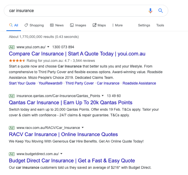
After months of testing, it looks like Google has released a new look for ads in the Search Engine Results pages across both desktop and mobile.
Google themselves have confirmed the changes saying:
“ With this new design, a website’s branding can be front and center, helping you better understand where the information is coming from and what pages have what you’re looking for. The name of the website and its icon appear at the top of the results card to help anchor each result, so you can more easily scan the page of results and decide what to explore next. Site owners can learn more about how to choose their preferred icon for organic listings here.”
Before:
After:
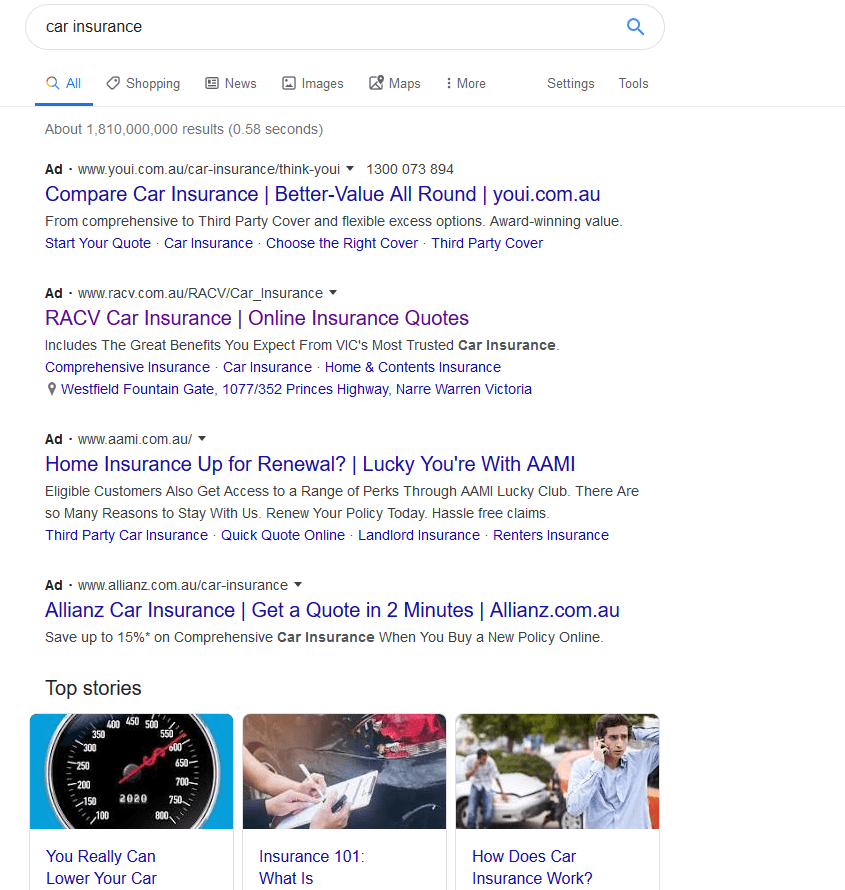
When you search for a product or service and we have a useful ad to show, you’ll see a bolded ad label at the top of the card alongside the web address so you can quickly identify where the information is coming from. As we continue to make new content formats and useful actions available—from buying movie tickets to playing podcasts—this new design allows us to add more action buttons and helpful previews to search results cards, all while giving you a better sense of the web page’s content with clear attribution back to the source. This redesign is coming first to mobile and will be rolling out over the next few days. Stay tuned for even more fresh ways that Search can help you find what you’re looking for.”
Google’s constant testing and improvement of its platform is well noted across the digital marketing industry with regular updates of both its performance algorithm and the display of its ads and search listings, so it comes as no real surprise that this change has been implemented, but with all changes comes a flow on effect. So what does this mean for you?
- Google is saying that this will provide easier differentiation between Ad results and organic results.
- More action buttons will be available shortly to make navigation to certain important pages on a website a lot more streamlined.
- Simpler flow across all search engines overall has also been promised by Google.
Google is always aiming to improve its platform for better usability, but these changes don’t really seem to benefit the end user as it is now a bit more difficult to see the difference between an organic search result and a search result that’s a paid ad. Also, the addition of the favicon for organic searches that was added recently creates a bit of cognitive overload on pages in general, due to increasing the clutter which isn’t a positive for users. In our books, this update was actually a bit of a negative for ads search results and hopefully, this is something Google can rectify in their next update.


